Are you looking for clever ways to increase sales on your eCommerce website? Well, you’ve hit a gold mine. This blog will help you achieve it.
Did you know that it’s 7 times more expensive to get a new customer than retain an existing one? (Source: Invesp)
Imagine the last time you went shopping. How did you feel when you just couldn’t find the right color of the t-shirt or the perfect study table for your office? Frustrated? Angry? What if there was no one to guide you to your desired product? Chances are that you would never return to that shop again.
This is where user experience comes in. By understanding the entire process through the user’s perspective you can define customer journeys on your website that are most conducive to business success. Remember that if customers can’t find what they’re looking for, there’s no way they’ll be able to buy it.
Therefore, keeping your user personas in mind while designing your eCommerce site is essential to creating a seamless user experience and a profitable business.
Let’s look at some important factors to address while deciding the right experience for your users. “Thus, in the future, instead of buying bananas in a grocery store, you could go pick them off a tree in a virtual jungle.”- Yasuhiro Fukushima, Japanese business executive
It is debatable whether the appearance of a website should be given priority when customers tend to prefer proper functionality. However, many e-Commerce websites have already taken it up a notch with augmented reality. It provides the perfect mix between a sleek appearance and efficient functionality that enables potential buyers to visualize products as it would be in real life.
Let’s take a look at Pepperfry, a furniture brand that has adopted AR to create a seamless shopping experience for those puzzling and time-consuming market runs.
Their app allows you to take a picture of your room by accessing your camera and whichever furniture piece that you would have chosen can be placed with the help of 3D augmented reality into that photo frame of your room. This allows you to not only see how the furniture would look in your room but also make changes to its positioning.
In 2019, Gartner predicted that 100 million consumers will shop using AR by 2020, so it is definitely the best strategy to adopt this year. According to the Baymard Institute, 23% of US buyers abandoned their cart in 2019 because of a too long or complicated checkout process.
One of the things that highly concerns online shoppers despite the smooth payment procedure is privacy. Hence, any attempt to extract more information from users than required can raise fears, uncertainties, and doubts about finalizing the purchase.
Customers never appreciate overly complicated checkout forms. Data shows that the highest UX score is for a two-step checkout and there’s a significant decline in scores for checkouts of more than six steps.
Another hiccup along the way is setting up an account especially for smaller purchases. This extra step will only provide more opportunities for customers to leave the site.
Hence it is suggested to keep the flow simple incorporating more ways to pay to satisfy your diverse clientele. This one technique alone can help you increase sales on your eCommerce website by at least 3%.
This will determine your product classification and what categories you choose to highlight on your main menu. Using menus, filters and smart searches can simplify the process so that customers don’t think of shopping as a chore.

(shopify)
To ensure better user experience, refrain from trying to reinvent the wheel. Instead, present visitors with a familiar user interface for your site’s navigation system. Segment your products into categories according to type, design, usage, or any other relevant parameters so your visitors can easily find what they’re looking for.
When you’re designing the navigation system, place subcategories under multiple categories, as is logical and appropriate, to ensure users don’t miss them.
To enable users to easily search for products, adopt artificial intelligence (AI) to enable smart searches on your site. The Pinterest Web site provides an example of this. Pinterest updated its Chrome extension in 2017, allowing users to select an object in any online image and ask Pinterest to find similar objects using image-recognition software.
As 1 in 5 searches on US android mobile apps are voice searches It’s also possible to create a custom Alexa skill. This lets you open up a new sales channel by enabling users to purchase products simply by uttering a few words rather than them having to visit your Web site.
Another well-received strategy is to have personalized product recommendations. It’s like having a customer representative giving product suggestions.
For instance, you can have product recommendations to display similar products to the one the customer is viewing in a section called “Customers who bought this item also bought …” This can help guide users to the right products and allow them to discover new ones, thus, potentially, increasing their average order value and creating a better user experience.
Another widely used recommendation is a “best seller” or “trending” section. These work well because they offer social proof. It makes customers think that if other people are finding those specific products, it must be for a good reason. This in turn will increase sales on your eCommerce website. (Ajio & Koovs – Though different brands present their users with similar User Interfaces)

(Amazon.com recommends items to improve a user’s experience) Feedback is an integral part of any form of communication and it applies to online shopping as well. Once the feedback is collected, you can showcase it under specific products or different parts of your eCommerce site.
It will help gain the trust of new visitors. If you get bad feedback, make sure to follow up with the customer to acknowledge that the issue is being fixed. Customer journeys don’t conclude with their first purchases.
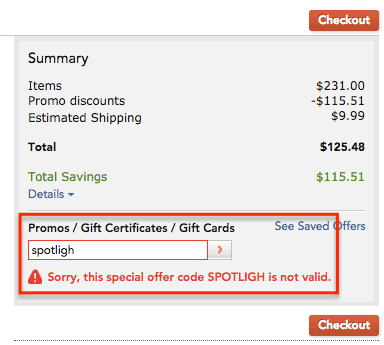
In addition to asking for feedback, it’s essential to engage with them constantly to keep at the top of their minds. Awarding top customers with special offers and product exclusives can also serve as an encouragement to bring them back to the site. Once more, make sure that any special promotional codes or offers are easily redeemable. Otherwise, it can cause a bad user experience.
As you can see in the following image, customer journeys are recorded and showcased beautifully in the form of videos. This makes your products look authentic and capable of impacting user’s lives in a positive way.

A number of ways through which social proof can be shown are customer reviews, user-generated content like social media feeds, or the number of followers or email subscribers.
Any data you can provide that shows support from others can influence visitors to gain more trust in your store, in turn, reducing potential doubts or concerns about your products, which makes for better user experience. A Google study reveals that 46% of people prefer to use their smartphone for the entire purchasing process. While the website and app-based mobile shopping are currently similarly popular, dedicated apps that are simpler to use will gain more traction in the years to come.
In 2016, 20.6 percent of all online e-commerce activity happened on mobile, and in 2020 that figure will reach 45 percent. Any site that is not optimized for mobile is simply alienating users on the platform they are most inclined to use.
To optimize your store for mobile, start by developing a mobile responsive web site whose layout automatically adjusts to fit your users’ screens. Make sure your web site loads quickly, its fonts are clear and easy to read on mobile devices, and tappable elements are sufficiently large touch targets.
You could also consider developing an android app or iOS app for your e-commerce store to improve the user experience and provide faster checkouts. If you don’t have the budget for building an app you can build a progressive web app where you get the best of both the worlds, an end to end website as well as a full-fledged application when viewed on mobile.
In 2019, businesses reported a 7.9% increase in sales on eCommerce websites when they provided users with access to their store through mobile apps.
(Amazon.com) However seamless your experience is users can still get confused as different apps and sites use different solutions to address the same concern. Helping your customers in real-time while they are shopping is the best way to engage with them and also gain insight into what needs to be improved on your website.
By facilitating real-time conversations through live chat, you can guide customers to the products they need, offer alternatives such as cross-sells and upsells and reduce their urge to comparison shop by keeping them engaged throughout the shopping process.
Integrating live chat with your Web site not only improves the customer experience but also boosts conversions. Good support can increase sales on the eCommerce website by 3% by introducing trust among new buyers and also building repetitive customers.

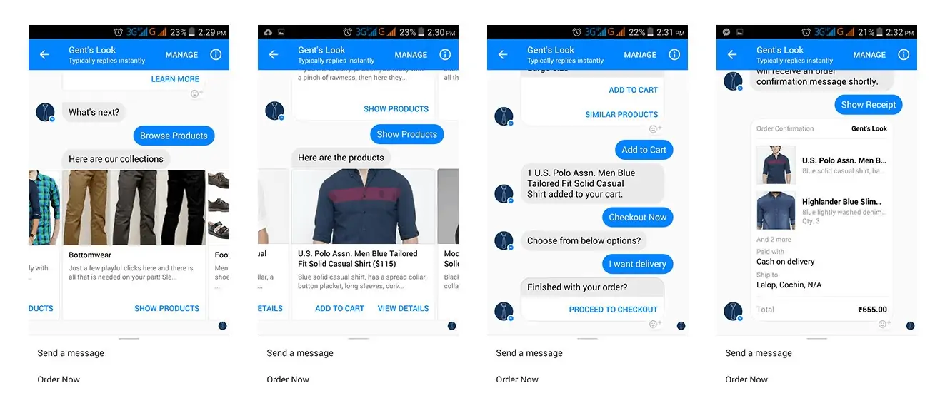
In addition to integrating live chat with your product pages, offer live chat during the checkout process to help users understand shipping or delivery costs and guide them seamlessly through the payment process.
For example, Amazon provides a Contact Us 24×7 option at the bottom of their payment page. Once the customer clicks this button, Amazon offers the choice to either chat with a support agent or receive a voice call on the customer’s registered mobile number. Thus, Amazon makes it extremely convenient for customers to get help instantly during checkout, improving the user experience immensely.
Looking for a reliable mobile app development partner? Eiosys is a leading mobile app development company, helping businesses build and launch custom Android and iOS apps with confidence. Connect with our skilled app developers and get the right support from some of the finest experts in the industry.


