Aris Shaikh is the author of this blog which states the checkout page optimization tips for increasing conversion on E-commerce platform.
We sat down in a conversation with him to understand the top 13 features that he feels are important for increasing conversions on the E-commerce platform.
After 14 years in this industry and building hundreds of e-commerce and corporate websites, Aris told us that the below-listed factors can add valuable insights into enhancing user experience and driving sales. His expertise in advanced analytics and user behaviour analysis ensures these tips are both effective and practical.
Behind every e-commerce website visit, carefully crafted products and every marketing copy is a ton of effort, money and time generously spent. And while UX deserves a lot of attention, the key component that truly ties the whole thing together is the checkout page. It determines the sales you make and the consequential success of your e-commerce website. Thus, you must keep track of both the total number of visits to your website and those who actually place an order.
You’re doing something wrong if a sizable portion of your incoming traffic just stops at the checkout page, without making a purchase. Pricing, customer intent and the website’s usability are three major reasons for abandoned carts. Since there is little you can do about the first two, you can only count on the improvement of the checkout flow to increase conversions. Let’s get right into it:
1. Offer Single Page Checkout
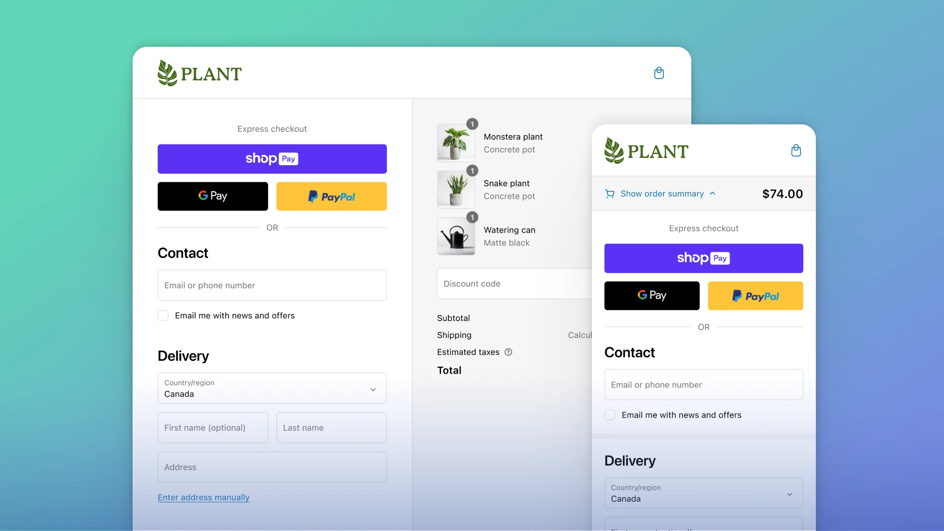
What better to start than implementing a single-page checkout on your website? Single-page checkout displays all the features of a typical checkout procedure on a single page and allows the customers to fill in the checkout fields in any particular order. All the details regarding billing, shipping and payment can be filled on the same page, encouraging a quicker checkout. Verification of details, too, can be done without switching pages. It also makes the page design simpler and easier to understand, resulting in a higher conversion rate.
2. Give Guest Checkout Option
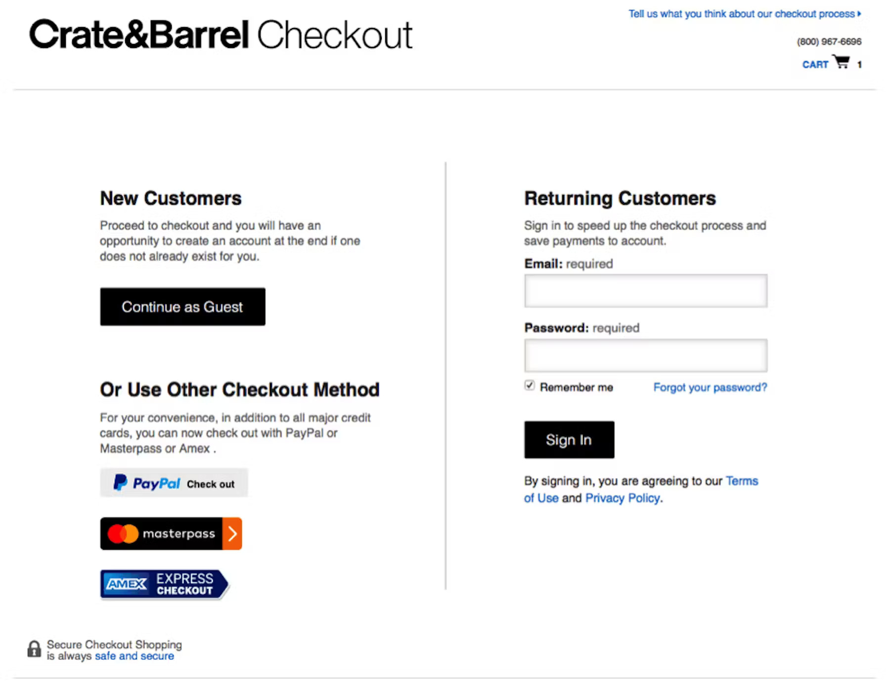
The one pet peeve we collectively share is standing in a queue for long, only to know we had to fill out a form to get through. Similarly, when buying things online, people don’t want to fill out forms and create an account. If they have forgotten the password to their existing account, there is another password recovery process to deal with. To avoid losing the shopper over these unnecessary hurdles, allow them to buy without creating an account right away. Once the order is placed, give an option to create an account with a single click. Your customers are more likely to give out their contact details after the purchase is complete. This ensures a smooth checkout process and potentially encourages the customer to come back.
3. Get Rid of Unnecessary Form Fields
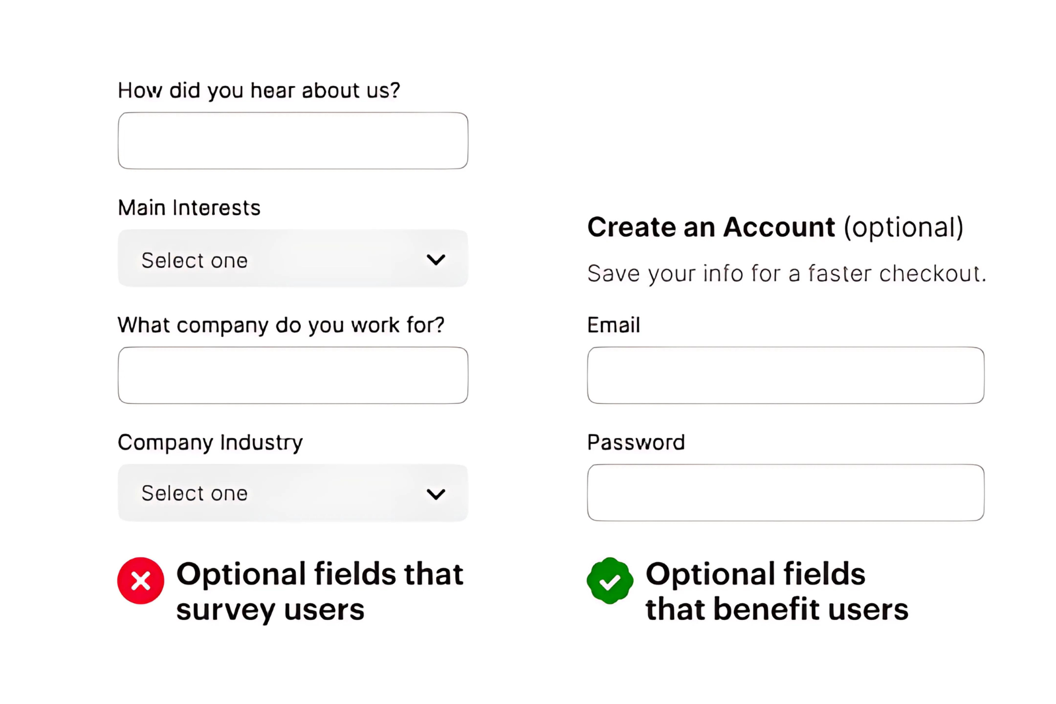
Avoid leaving out forms with too many questions for your customers. If you demand a lot of their time or mental energy, they will put off making a purchase. It is more likely that they will follow through and complete the form if you ask for less information. You can also test several form variations to see what details your customers are ready to share with you.
4. Add Security Badges

A website’s level of security is often of concern to people, especially new users. Because there is a lack of trust, they may hesitate to enter their payment information. Thus, to reassure them that your website is reliable and their payments are safe, bring out the security badges! It could be as small as adding logos of various payment methods, security badges from Norton, McAfee or a short text reading “fast and secure payment.”
5. Show the Steps in the Checkout Process
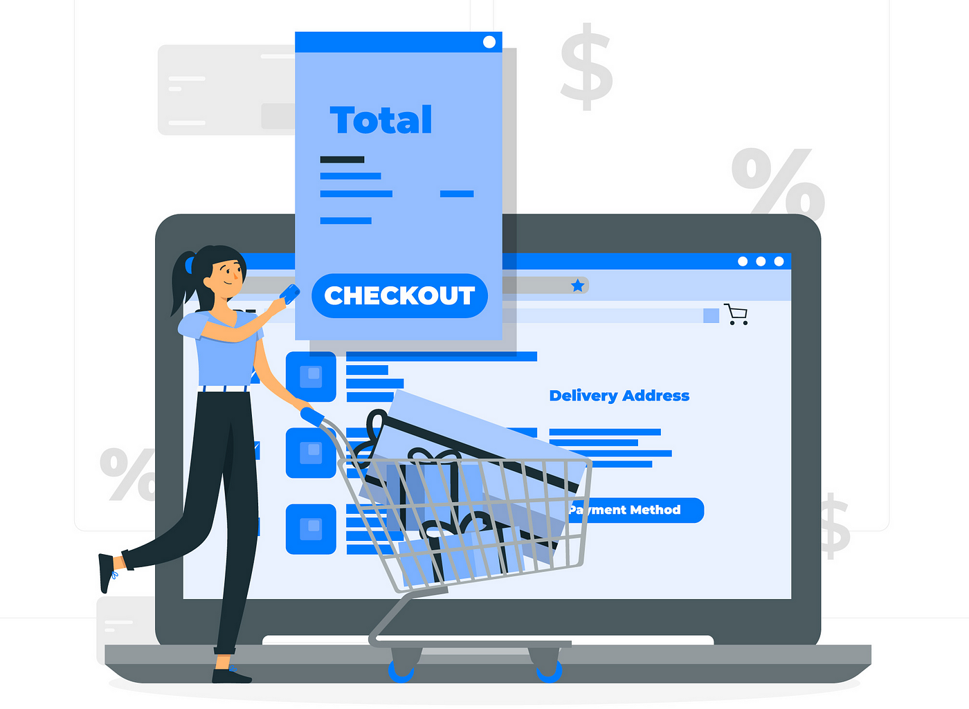
The number of steps in your eCommerce website’s checkout process may be greater or smaller than usual, depending on what you are offering. So when you are planning your checkout flow, be careful not to include too many steps because doing so could hurt your conversion rate. Display the steps along with an explanation of each and make the procedure appear quicker. Shoppers greatly benefit from having a visible progress indicator that displays the number of steps remaining in the checkout process, as it lets them know exactly where they are in the process, what comes next, and how long it will take.
6. Provide Multiple Payment Options

For an online business, it is essential to offer a variety of payment options for the customer to choose from. Statistics show that in 2021, 7% of customers, or more, abandoned their shopping carts due to a lack of enough payment options. Allow customers to choose the preferred payment method and billing currency. Multiple payment options and available currencies will probably reduce cart abandonment and motivate your customers to complete the checkout process.
7. Set Up Shopping Cart Abandonment Recovery Emails
Be it through push notifications, website pop-ups, chatbot messages or elaborate emails – show them what they are missing out on! Strategically prepare recovery emails with a personal touch to re-engage with the customers and show the value of your products. A customer is only lost if you allow them to slip away. With the right offer, however, a one-time cart abandoner could end up becoming a loyal brand fanatic.
Interesting read – Check out our blog on how to increase email signups on your website.
8. Eliminate Distractions

Information can be many things but is best when it is clear, concise and easy to understand; everything else is an unnecessary distraction. Customers put off their purchases because of misleading information. Hence, much of the checkout process optimization requires eliminating distractions. Only the necessary information must be available such that the customer understands the steps of the checkout process.
9. Provide Discount Options
We all love a sweet discount. Offering a good discount on a purchase cannot possibly go wrong. Instead of only offering discounts, try to include other incentives like coupons, freebies, software upgrades to PRO editions, or extended subscription periods. Cross-selling discounted items or providing free products that go with their order are other options. You’d be surprised (or not) how eager consumers are to purchase when given a fantastic opportunity.
The ability to tailor the discount they are about to receive may be the second best thing to a discount. Give your customers some flexibility over when and how they can avail of a particular discount. This not only makes their experience a little more tailored to them but also encourages them to “experiment,” which can encourage them to buy more things than they had initially planned. It also puts them in control of finding the best combination of coupon usage and increases transparency, ensuring that customers are never caught off guard and dissatisfied.
10. Make your Checkout Page Mobile Responsive
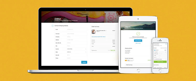
If a website is mobile-friendly, 74% of users think they are more likely to visit it again in the future. Thus, your website must be optimised for any device, including mobile phones. It should have a responsive design which calls for your content to display consistently whether it is accessed on a computer, a tablet or a smartphone. On the desktop version, for instance, you can have lengthier forms and more processes, but it is advised to have shorter forms and a one-page checkout on mobile.
Approximately 19% of online shoppers worldwide participate in mobile shopping on a monthly basis, and that percentage is rising daily. Your conversion rates will rise dramatically if your website is mobile-friendly, especially in this day and age when so many of your potential customers use smartphones to browse the internet. Additionally, you can always use mobile-friendly testing tools, such as Google’s Mobile-friendly Test, to examine the condition, speed, and functionality of your website.
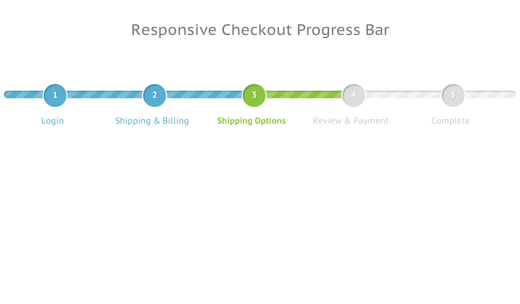
11. Display Progress Bar
Throughout the procedure and especially during the end, be honest with your customers about the price of the purchase. Display the total order price (including delivery) right away, even before the customer starts the checkout process. The delivery nation can be specified explicitly in the cart or automatically determined via localization, after which the total can be calculated.
Don’t charge them or send a confirmation email with different pricing after the order has been placed than what the customer agreed to while making the purchase from you. Anything else will simply result in negative feedback and fewer customers. Being straightforward with your customers can help you make more sales and retain more of them over the long run.
12. Maintain Transparency – No Hidden Costs

Only a progress bar helps you get away with a multi-step checkout process, that is how efficient it is! Customers may often be frustrated if there’s uncertainty regarding the checkout procedure and how long it will take. Showing a progress bar or an indicator helps them understand how far through they are in the procedure, and the number of steps before the checkout process is completed. If a customer can track their checkout progress, they are less likely to leave the checkout page.
13. Show Users How Much Money They Saved
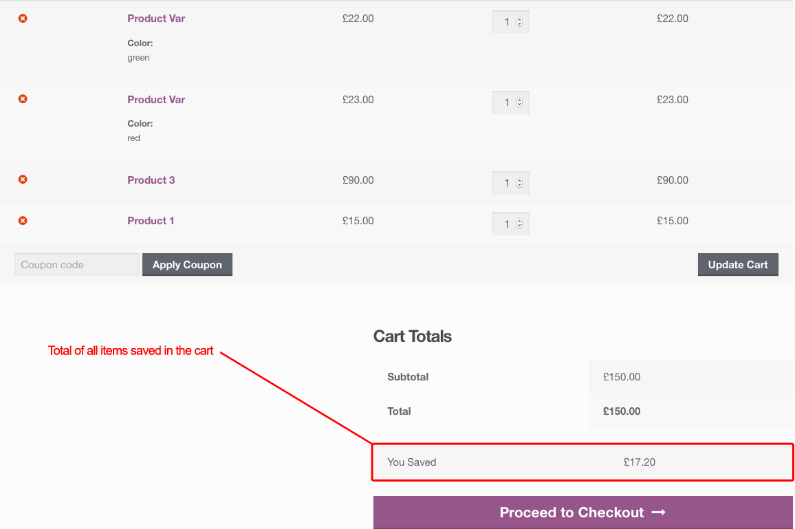
Everyone enjoys a good bargain. If you can show the previous price of a product, the customers are more likely to complete the order while it is still on sale. Apart from knowing they grabbed a wonderful deal, showing them how much they’ve saved on their order makes the shopping experience much more positive too, further making them feel more comfortable to press that checkout button. “You saved ₹X!” reads well, so leave them with a smile!
Bottom Line
With all these effective tips, we also hope to leave you with a smile and your business with more success!
An optimal and seamless purchasing experience is what a customer looks for, and your checkout page strategy is the key to that very lock. The shopping cart is ultimately what will make or ruin your e-Commerce business. Checkout optimization takes time and a whole lot of effort. Optimize your platform wisely and continue doing A/B testing at regular intervals to understand what works best for you.
If you are looking to create an eCommerce website or a mobile app to scale your business, you can schedule a consultation call with our in-house experts.


