Remember the days when door-to-door selling was a marketing strategy like none? Well, the times have changed! With the advent of the internet and technology, digital marketing has replaced many forms of traditional marketing!
If you’re a new-age entrepreneur, you might have come across (or even used) digital marketing techniques such as SEO, SEM, email marketing, social media marketing, and so on. You might be applying several of these strategies to boost your sales and increase your conversion rate.
But, do you know a crucial factor that influences your conversion rate? It’s your landing page. Your creative and remarketing technique may be on-point, but if the user clicks your ad and your landing page is slow to load, you might lose the game. Hence, landing pages make for the last piece of the puzzle in the successful implementation of a marketing campaign.
What makes for a good landing page? How to enhance the quality of landing pages? This blog will unleash the A to Z of landing pages to help your business gain maximum benefits from it.
What Are Landing Pages?
In simple terms, the web page on which you “land” after clicking on a link through social media ads, emails, SMS, Google, Meta, or YouTube is called a landing page. It’s a standalone web page created specifically to complement the marketing campaign and target a specific service or a product. Yes, as simple as that!
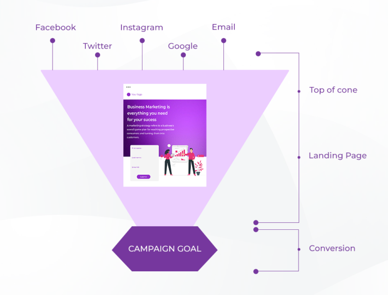
However, a landing page is not the same as a home page. How? Let’s see!
A home page is designed to accomplish several goals such as encouraging customers to explore more of the services and products offered by the company. On the other hand, a landing page has only one purpose which is to drive conversion. Also, it has a clear CTA (or call to action), it can be in the form of signing up on the platform, subscribing, or even buying a product.
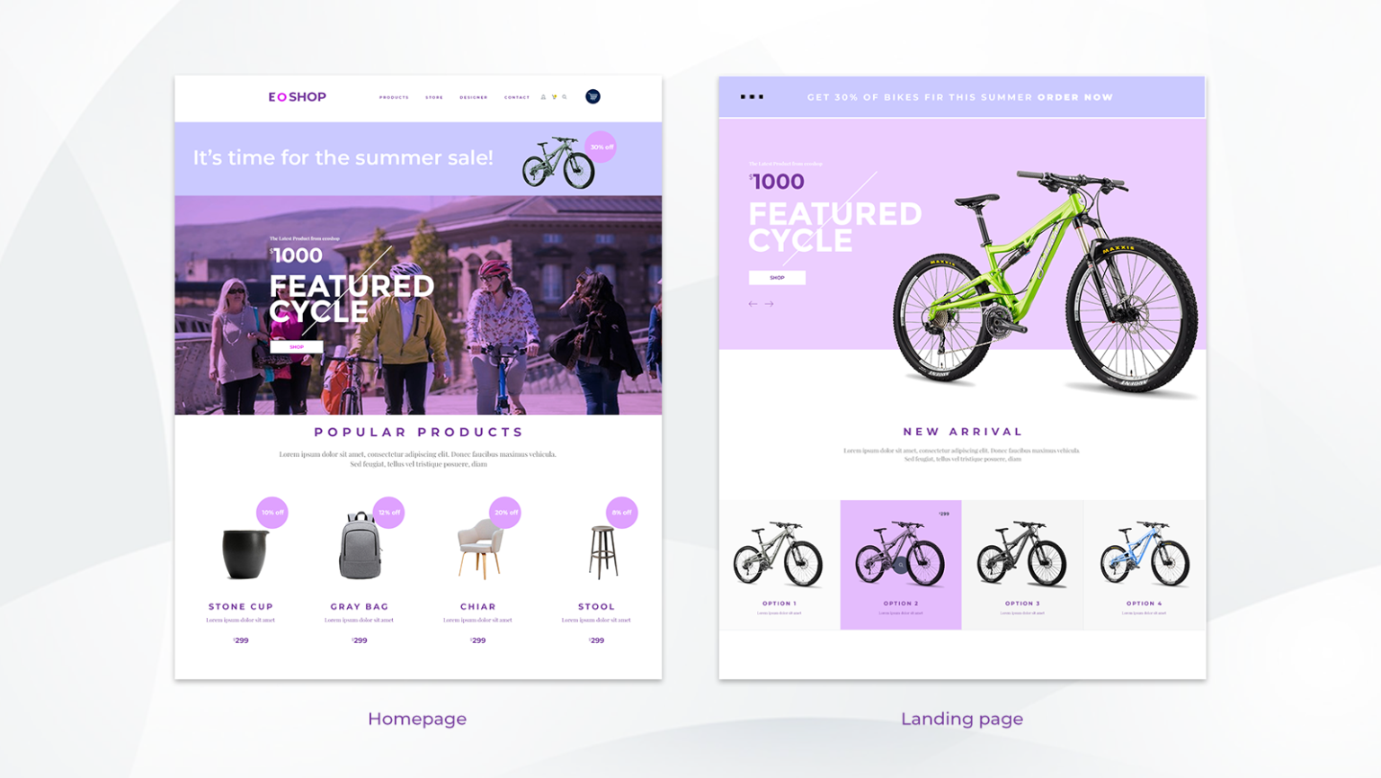
The above image illustrates a clear difference between the structure of the homepage and the landing page.
Types of Landing Pages
Lead Generation Landing Page
Popularly referred to as a “lead capturing page”, this type of landing page acts like a mini-web for your business and is responsible for garnering leads. Usually, this type of landing page offers a form wherein customers fill in their details to receive the promised services/details from the other end.
Moreover, through this type of landing page, you gain insights into your possible customers.
Bonus tip: To encourage your customers to fill in their details, you can offer additional benefits such as free webinars or ebooks, exclusive coupons or discounts, and more.
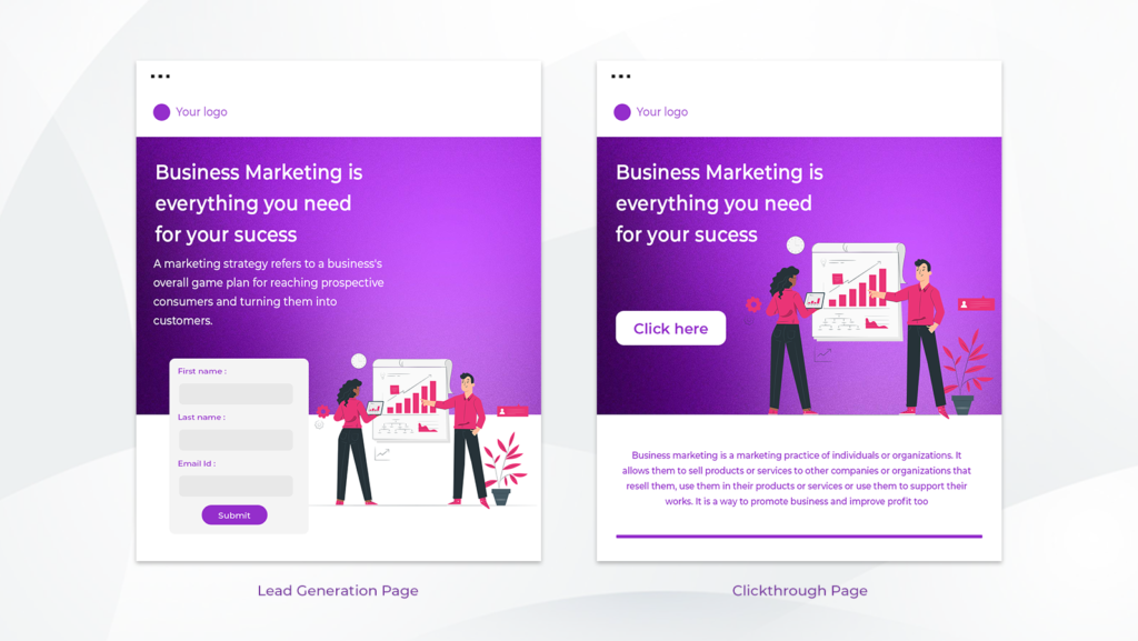
Click-Through Landing Page
The Click-through landing page encourages the viewer to take the next step, which is either buying a product or subscribing to the service. In short, it has a clear CTA. It’s more relevant to eCommerce platforms and subscription platforms. In contrast to the Lead Generation Landing Page, in Click-through Landing Pages an actual transaction of specific value happens.
For instance: Let’s suppose your business sells digital marketing courses and you designed a click-through landing page for the same. In your landing page copy, you talked about the online course, its perks, students benefited from it, feedback, and more, and towards the end encouraged your viewers to buy the product by clicking the “BUY NOW” tab.
How do you determine which type of landing page is best for your business?
Your business’s goals and priorities can help you determine the best landing page.
For instance, if you’re an eCommerce website willing to increase your sales then the click-through landing page is the best choice.
Similarly, if you want to magnify your email list for future marketing strategy then the lead generation landing page can be a wise choice.
Components of a Good Landing Page
A landing page is the first thing that users see when they hit a website. It’s the landing page’s responsibility to get the user to perform the desired action, whether it is signing up for an email list, making a purchase, or any other action that you want them to take.
In this section, we outline the components of a good landing page and some early tips on how to make your landing page better.
Grab the Attention of Your Viewer Through Enticing Visuals
The average attention span of people on the internet is gradually decreasing as they’re bombarded with tonnes of content every single second. However, businesses need to grab the attention of their audience to make a mark in the industry and stay ahead in the game.
To make your landing pages attractive, follow the simple rule of “first impression is the last impression”. Let’s consider two different scenarios:
While browsing for a real estate business or any other B2C service, you clicked on the company’s landing page. But, this page was slow to load, had no visuals, color scheme, font styles, and no clear CTA.
Unimpressed by your previous experience, you moved to another business’s landing page which was bright and colorful, had visuals, graphics, relatable headlines, and a bold CTA.
Which one of the landing pages do you think will win the attention of the customers? Undoubtedly the latter one as it contained nearly everything to be considered a good landing page.
In short, while designing your landing page make use of color, visual imagery, and graphics. Moreover, add your brand logo, an impressive video, or a photo grid on the topmost section of your landing page to attract viewers.
Did you know, using video content on your landing page can increase your conversion by almost 86%? Thus, don’t forget to use visual graphics or videos on your landing page to make it more appealing
Powerful Headlines are a Must!
While reading a newspaper, how do you determine whether a piece is worth reading or not? Of Course via headlines! Similarly, a powerful and actionable headline is the key to getting the attention of your viewers and gathering quality leads!
How do you write powerful headlines for your landing page?
Here are a few things to remember:
- Avoid using jargon and making grammatical errors.
- Keep it short and sweet under 20 words.
- Use statistics, if necessary.
- Use simple idioms.
- Keep it relatable.
Moreover, follow your major headline (H1) with a secondary headline (H2) that resonates with your audience and attempts to solve their problem.
Clear and Bold CTA!
The CTA is an integral component of a landing page. It is a simple phrase (such as “buy now”, “enroll me in ”, “start” or “subscribe”) that prompts the audience to take the next step on your page.
Moreover, it helps businesses to achieve their desired goals by expanding subscriber or newsletter lists, promoting premium services, and more.
Add Some Amazing Benefits of Your Product/Service
On a landing page, every word matters! You don’t want to fill it with unnecessary details and drive away your viewers, do you? So, what can you do to make your landing page more attractive?
While writing the copy of your landing page, make sure to write about the benefits of the product or service you’re trying to sell. Does it have to be exaggerated? No, simply talk about the advantages and how your product/service can solve the customer’s problems.
But, why is it important? Your viewers are most likely to convert when they understand the benefits your business is offering.
Testimonials Help to Build Trust!
Once you’ve talked about the benefits your business is offering, it’s time to back up your claims with honest customer testimonials. Usually, a customer testimonial is a quote from your customers who have used your product/service and want to share their genuine reviews. It can be either in the form of written quotes with pictures or a video testimonial.
Integrating customer testimonials on your landing page will help your business to build trust and nudge your viewer to click the CTA.
Don’t Forget a Closing Statement!
Your closing statement needs to be powerful and offer a persuasive argument to customers on why they should take the next step by clicking the CTA!
A good closing statement gives a final push to the viewers to get on board with your business.
Best Practises to Optimise Landing Pages
Don’t be the jack of all trades!
Instead of targeting a wide range of audiences, try to segment them into different categories and attract them through multiple landing pages. Also, make sure that the copy of your landing page resonates with your target audience.
Make your landing page mobile-friendly.
A wide range of viewers use mobile phones, so make sure your web page loads quickly and fits into the frame of different devices.
Give your copy a human touch!
Instead of only talking about the benefits of your business, talk about how the customer can benefit from becoming a member of your business.
Important content deserves the topmost spot!
Do not expect the viewer to scroll down to the bottom of the page to click the CTA tab. Instead, you can keep your CTA above the fold of your landing page to maximize its visibility.
Write a short, sweet, and actionable copy.
While writing the copy of your landing page, do not fill it with jargon or long sentences as they’ll make it uninteresting. Instead, write short and crisp text with maximum readability.
Ensure Consistency to Get Good Conversions
Almost all of the viewers on your landing page might come from different social channels such as social media ads or emails. As a business, you need to make sure that the customers do not face any difficulty while moving from point A to point B of your sales funnel.
Moreover, the content on your landing page must be consistent with the content on different social channels.
Minimise Navigation
The sole aim of your landing page must be to prompt the viewers to click the CTA tab. Instead of overcrowding your page with a menu tab or links to different pages, keep it simple and easy with just a bold CTA tab.
Make the next-step simple and easy to take
Whatever the purpose of your copy is, be it to prompt the viewer to subscribe or to buy a product, the form for the same should be extremely easy to fill. Also, make sure to keep only relevant and actionable things on your copy.
How to Promote Your Landing Pages?
Once you’ve published your landing page, it’s time to spread the word among your audience.
How would you do this? Here are a few ideas:
1) Emails and Newsletters: You can send customized emails or newsletters to your potential customers talking about your business offerings and backlink the landing page to drive traffic on the same. Check out our blog on top email marketing tools that can help you achieve this.
2) Social Media Ad Campaign: Facebook, Instagram or YouTube ads are one of the best ways to spread the word about your business to a large set of audience and drive traffic to your landing page.
3) Google Adwords: – You can bid for keywords with high search volume on Google ads. This ads can either be search ads or display ads depending on your product or service.
4) Conducting virtual events and offering discounts are also some of the ways to attract viewers to your landing page.
FAQs
Are landing pages important?
Yes, landing pages are important as they help to drive a lot of traffic to the business. Further, landing pages also play a major role in increasing conversions for a business.
Can one have multiple landing pages?
Yes, most businesses have multiple landing pages for different products/services.
How can landing pages help my business?
Landing pages help to increase brand awareness, attract customers, garner leads, and convert your target audience. Further, it creates the first impression of your business in the customers’ minds.
Is A/B testing of landing pages important?
Yes, A/B testing helps you to determine the common errors in your landing pages and increase conversion by picking up the best one.
Why optimize landing pages?
Regular optimization of your landing pages helps to achieve the highest conversion rate, maximize the value of your ad spendings, and lower customer acquisition costs.
How do I create a landing page?
You can get in touch with your web developer to create customized landing pages as per your requirement.
Conclusion
Thanks for taking the time to read our blog. We hope we’ve helped you with some ideas on how to design landing pages to improve your conversions and performance. If you’re looking for a website development or maintenance service that will help with your design needs and boost your conversion rates, contact us at sales@eiosys.com.
